 Number 235 - November 2002 |

|
| The Science of Colors | |
|
by Woei Yu Choo, October 2002, Warwick Valley PC Users Group | |
|
I was helping a colleague
with creating some stationery for a client and, like Alice in
Wonderland, I found myself falling through a hole of bewilderment when I
was confronted with the varying factors and options concerning print
production.
In this day and age, where technology has made nearly every chore a snap, I was surprised to learn that the printing industry is unforgiving and an exceptionally costly business to take on without basic printing industry knowledge under your belt. How difficult could it be, one asks. After all, don't you just save the file in an appropriate fIle format (e.g., PSD, TIFF, etc.), and let the printer worry about the rest? Devices like monitors, scanners, digital cameras uses the combination of just three colors: Red, Green and Blue (known as the "RGB") to display more than 16.7 million colors. These 3 colors at full intensities combined will make white. Yes and no. Yes, you may be able to rely on your printer to do the job but unless money is no concern to you, you must to pay careful attention to details early in the design process to save yourself money, time and avoid heartache later on. What are those details that a budget conscious person should consider before sending the job to the press? The colors used, the type of artwork, the type of paper used, the level of quality (basic, good, premium or showcase), the type of finished product (business card, envelope), the resolution and the fonts are just the tip of the iceberg when it comes to factors to consider. It's impossible for me to cover all aspects about the printing process so, in the interest of brevity, I will devote this article to, as the title suggests, 'the science of colors'. Color Medium As we all know, the cornerstone of printing is colors. But printing colors is more than just what is in a rainbow. Have you ever painstakingly created beautiful artwork on your computer, sent it off to a printer and the print job came back all wrong? This is because, by their very natures, monitors and printers reproduce color in different ways. Devices like monitors, scanners, digital cameras use the combination of just three colors: Red, Green and Blue (known as the "RGB") to display more than 16.7 million colors. These three colors at full intensities combined will make white. Most print presses, on the other hand, use a different sort of colors: Cyan (bluish), Magenta (purplish), Yellow and Black (known as "CMYK") producing slightly less than 16.7 million colors. This 4-color process is the heart of every successful color print job, regardless of its size or complexity. Combining the CMY inks at full saturation should yield a resulting color of black. However impurities in the inks rarely make that happen and only by the addition of the black ink can that take place. As for the question why the colors are referred to as CMYK and not CMYB? For the simple reason that the last color will not be mistaken for Blue rather than Black. Below, in Figure 1, is an example of how the RGB colors looks like after using a CMYK print process. 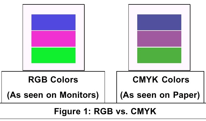
What you see are two different sets of color models. Although they are both capable of producing millions of colors on their own, some colors produced by RGB cannot be matched in print. Similarly, some CMYK colors cannot be attained on-screen. In fact, the available colors in CMYK is very small compared to the range of colors a human eye can see. Sadly, two of the favorite colors of most people, blue and red are the hardest hit. To add to the complexity, the range of colors produced by RGB varies widely for different type of devices. When RGB colors are "out of the CMYK color gamut", they must be "condensed" (the next best color chosen) when printing. This further degrades the quality of the artwork, underscoring the fact that what you see is not what you get. |
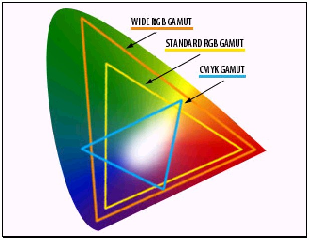
Figure 2 above is an illustration (from Adobe) of the different color gamuts that RGB and CMYK have. What is our solution? Your file must "speak" CMYK or, more accurately, translate a RGB file to a CMYK-based one that a printer or press can understand. Most professional graphic or page-layout tool can help you with that. Forget about using applications like Microsoft Publisher or Microsoft Word. If you are ever brave enough send a file to a print shop in those formats, be ready to be laughed out of their shop. But RGB-CMYK conversion is not the magical solution to all your color problems. As mentioned earlier, because of the gamut range, some of the colors in RGB cannot be recreated with CMYK. But that is something that everyone in the industry puts up with. Professionals suggest that a layout should be created with a CMYK definition instead of RGB definition to prevent potential disappointment later on. If you are a stickler for perfection, you can go a step further which brings us to the next section--Spot Colors. Spot Colors Because some colors, like Pepsi blue, cannot be rendered using CMYK, printers overcome that by using spot colors. Spot colors are specially mixed inks that are applied to the press instead of, or in addition to, using the four-color inks process. Obviously the color range is more vibrant and process characteristics, such as day-glow or metallic ink, that just isn't available in regular process inks. In certain situation, spot printing can help reduce cost significantly. For example, if the artwork contains just black and another color, say red, cost is reduced since only two ink rollers, two plates and two negative are used. Conversely using CMYK, you would need three sets of inks (Magenta, Yellow and Black) along with 3 sets of plates, etc to do the same job. When printing full-color art work, adding a spot color will dramatically increase the cost of printing. You will add one more color to the four colors that are already being used resulting In a five-color job using five inks, rollers, negatives, plates, etc. To know what spot colors are available, purchase a commercial color guide or process color book. These books contain thousands of colors strips that show you exactly what a color will look like printed. The colors in the books vary depending on which company it came from, so be sure to find out which company your printer uses before purchasing. Exposure to light changes these guides over time so, to be on the safe side, replace the books yearly. The most common of spot color standards is the Pantone Matching System by Pantone Inc. They not only make and sell ink, but they have a process which enables printers to mix the exact same colors from a set of base inks making them popular are 1/8" away from the trim line. More Color Tricks There are more tricks one can do to make your artwork look snazzy. One is to add a layer of gloss by using varnishes and coatings. Gloss can bring out the color, creating a greater visual impact. The type of paper used can make a difference too. Printing on very white sheets make your colors really stand out. Smooth, coated sheets help retain color on top of the paper fibers, resulting in a brighter and more intense look compared to those printed on textured sheets. Conclusion The lesson here is that color is still a tricky business. If you still can't get your printer to create that perfect blue of a clear summer sky, be ready to recognize the inevitable and accept the nearest color compromise. Woei Yu Choo is a Senior Internet Developer at Florida, NY-based Web inSights, L.L.C., a soft-ware services and consulting company. Besides being the WVPCUG's Graphics Guru she is also the Intermediate User SIG leader and a Web Development workshop presenter. She may be contacted at woeiyuchoo@webinsightsllc.com |
|
Number 235 - November 2002
|
|