 Number 210 - November 2000 |
| The Ampersand | ||
| by Major Keary in Aug 2000 PC Update, Melbourne, Australia | ||
|
The symbol that represents and (or et
in French and Latin) has a remarkable range of glyphs, some of which
are particularly ornate. The ampersand was originally a ligature of the
letters, e and t, and in some
typefaces retains that form. A ligature is achieved by close kerning a
pair of letters so that they form a joining point (a ligature). Usually
there is some variation of design to facilitate the effect and some
typefaces come with expert fonts where the ligatures are to be found.
Diphthongs (oe and ae) are another form of ligature.
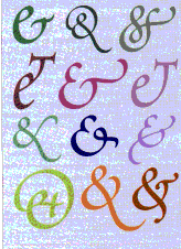
In most typefaces the ampersand has gone beyond being a ligature, assuming a glyph all of its own. The common form, &, does not readily reveal its origin, the word et. The name, ampersand, is a corruption of the original form et per se, and, which became and per se, and is now ampersand.1 In some typefaces the e and t are quite distinguishable and, if one looks carefully, they can be identified in some of the ornate italic forms. Some type designs, especially those that provide swash variants, offer a choice of several ampersand glyphs. Poetica, which is similar to Zapf Chancery, offers no less than fifty-eight ampersand designs from which to choose in a dedicated font (see Figure). Swash characters have lots of flourishes and other adornments and are generally based on italic forms. The ampersand has been in use for some 2000 years; the earliest example is in some Latin writing from around AD 45, and another - dating from AD 79 - was found scrawled on a wall in Pompeii. Even though not used in many languages apart from English--other than as convenient symbol in computer-related programs, scripts, tags, and the like--the ampersand is included in many non-latin character sets (Greek and Serbian, for example) largely because of ISO standards. |
A somewhat dubious use of the ampersand is to make a difference between one typeface and another. The name of a typeface can be patented, but its appearance cannot. Thus we find what appears to be the same design popping up under several different names, but there is usually some token alteration, such as a slight change of weight. In some cases no attempt is made to change anything other than to substitute a new glyph (pinched from somewhere else) for the ampersand.
|
|
|
Number 210 - November 2000
|
|
|